Brand: MAERIN | Fragrance: ROSE SILT | Audience: for women | Volume: 50 ml
1. Structure: A Two-Piece Lid-and-Base Rigid Box
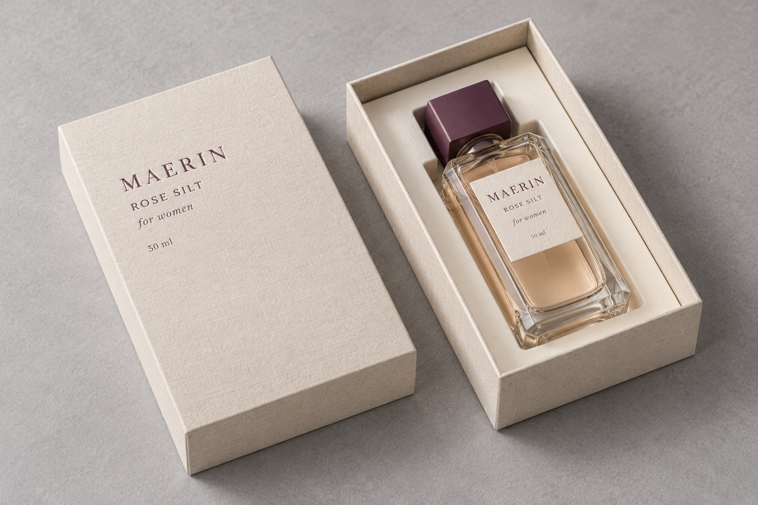
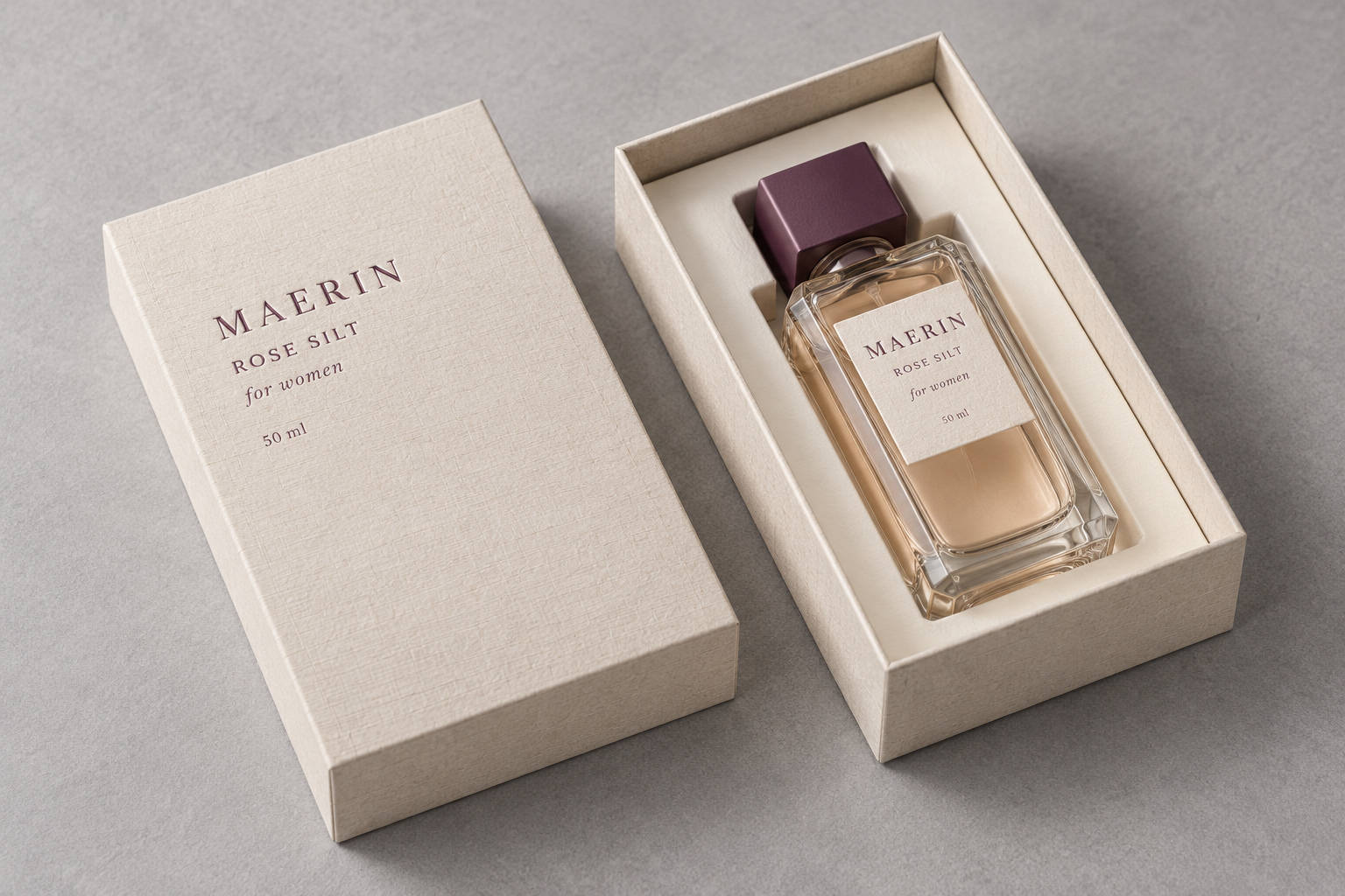
The box for MAERIN ROSE SILT is a classic two-piece rigid structure: a separate lid lifts from the base, and the base carries a fitted paperboard insert. The 50ml square glass bottle sits in a die-cut pocket, upright and clear of the cap clearance. This lid-and-base form is a dependable choice for womens fragrance - it presents the bottle cleanly, protects it in shipping, and keeps manufacturing repeatable across long production runs.
2. Material: Textured Fiber Paper and Spot Color
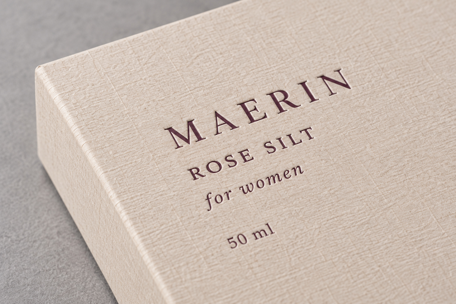
What makes this box read premium is not decoration - it is the paper. The outer cover is a cream textured fiber paper with a visible grain that customers feel before they read the brand name. The printing uses a single deep wine-red spot color, matching the bottle cap. No foil, no glitter, no overprinting: one paper grain and one confident ink color. This restraint is deliberate, and it is harder to execute well than it looks.
3. Manufacturing: Greyboard, Wrapping and Mitered Corners
Production starts with greyboard cut and V-grooved to the lid and base dimensions. The textured paper is then wrapped around the board. Because the paper has a fiber grain, grain direction is fixed around the box so the wrap looks consistent on every face. Corners are mitered - cut at 45 degrees and folded so no raw board edge shows and the paper joins cleanly. Spot color printing runs with controlled ink density: textured paper absorbs ink unevenly, so the first sheet is checked before the run continues.
4. Quality Control: Ink Density, Corners and Insert Fit
The QC checks that matter most on this style are the ones textured paper makes difficult. Ink density is checked on the first and repeated sheets, because the wine-red spot color must read the same on every box. Corners are checked for gap, lift and grain alignment. The lid is checked for fit - it should seat evenly without rocking. And the insert is fitted to a physical bottle before mass production, so the pocket holds the bottle snugly and the cap clears the lid. These checks are repeated on every run, not just the first sample.
5. For Buyers: What to Specify on Your Enquiry
To quote this lid-and-base textured paper box accurately, we need four inputs: quantity per order, box size, artwork files, and target price. With these we can confirm greyboard thickness, paper selection, spot color vs Pantone matching, insert layout and sampling time. We quote on an order structure because textured paper and spot color have real production variables - paper lot, ink density and insert tooling - that we need to lock before planning capacity for your launch calendar and annual repeat orders.
6. Application and Case: A Womens Fragrance Launch
This structure suits womens fragrances that lean into a soft, tactile brand world: a 50ml Eau de Parfum in a gift set, a seasonal launch, or a brand building a calm, natural visual language across SKUs. In our production, the workflow is the same for every customer: receive your bottle or sample specification, adjust the insert pocket and paper selection, approve a physical sample, then repeat the same specification across multiple purchase orders with color and tolerance locked.
7. Trend: Tactile Minimalism Over Decoration
Premium fragrance packaging is moving away from heavy foil and busy patterns toward tactile minimalism: one textured paper, one strong brand color, a clean insert. Customers now photograph the paper grain and the typography as much as the bottle. On materials, more brands ask for textured papers with verified sourcing and recyclable board inserts. These choices do not change the structural rules - greyboard, wrapping, corner alignment and insert fit still decide quality - but they let a brand build a premium feel without over-decorating.
Conclusion
A lid-and-base rigid perfume box lives or dies by the material and the press. Textured fiber paper and a single spot color look simple, but they demand controlled ink density, aligned mitered corners and a precision insert - repeatably, across every unit in your programme. When these are locked from sampling onward, the same box can be produced at scale for a full fragrance launch. That is what a packaging manufacturer brings: a structure you can specify once and order again.
Contact Shenzhen CKT Print Co., Ltd.
For custom rigid boxes and long-term fragrance packaging programmes, contact our team:
Contact: Sherry Wu
Mobile / WhatsApp: +86 15815525889
Email: info@cktprint.com
Website: www.cktprint.com
Alibaba Store: https://cktprint.en.alibaba.com/
Factory Address: 2-3F, Building 3, Zhong Xin Industry Area, No.8 Yuhu Road, Fenggang Town, Dongguan City, Guangdong, PRC


 Your message must be between 20-3,000 characters!